Fight the Rise
See a Change | Make a Change
Fight the Rise is an awareness campaign I created for my senior project to educate the public about climate change and its effects on the National Parks.

Creating the Logo
Fight the Rise is a call for attention and a call for action. The logo had to reflect this. The font is Nobel Regular and Condensed Bold. The waves are obscuring most of “Rise”, which implies the rise of climate change but also calls the viewer to rise. The colors were important to the messages too. I couldn’t use a red and blue combination because it implied politics and Fight the Rise is a nonpartisan campaign, but I also avoided green because it wasn’t a color that inspired fast, decisive action. I settled on a light blue and gold, but the order mattered. The logo works best when the waves are lighter than the logo’s type; this allows for easier readability.

Developing the Narrative
Now I had a logo, but how was I going to show my audience the effects of climate change, especially when these effects are so gradual? Posters.
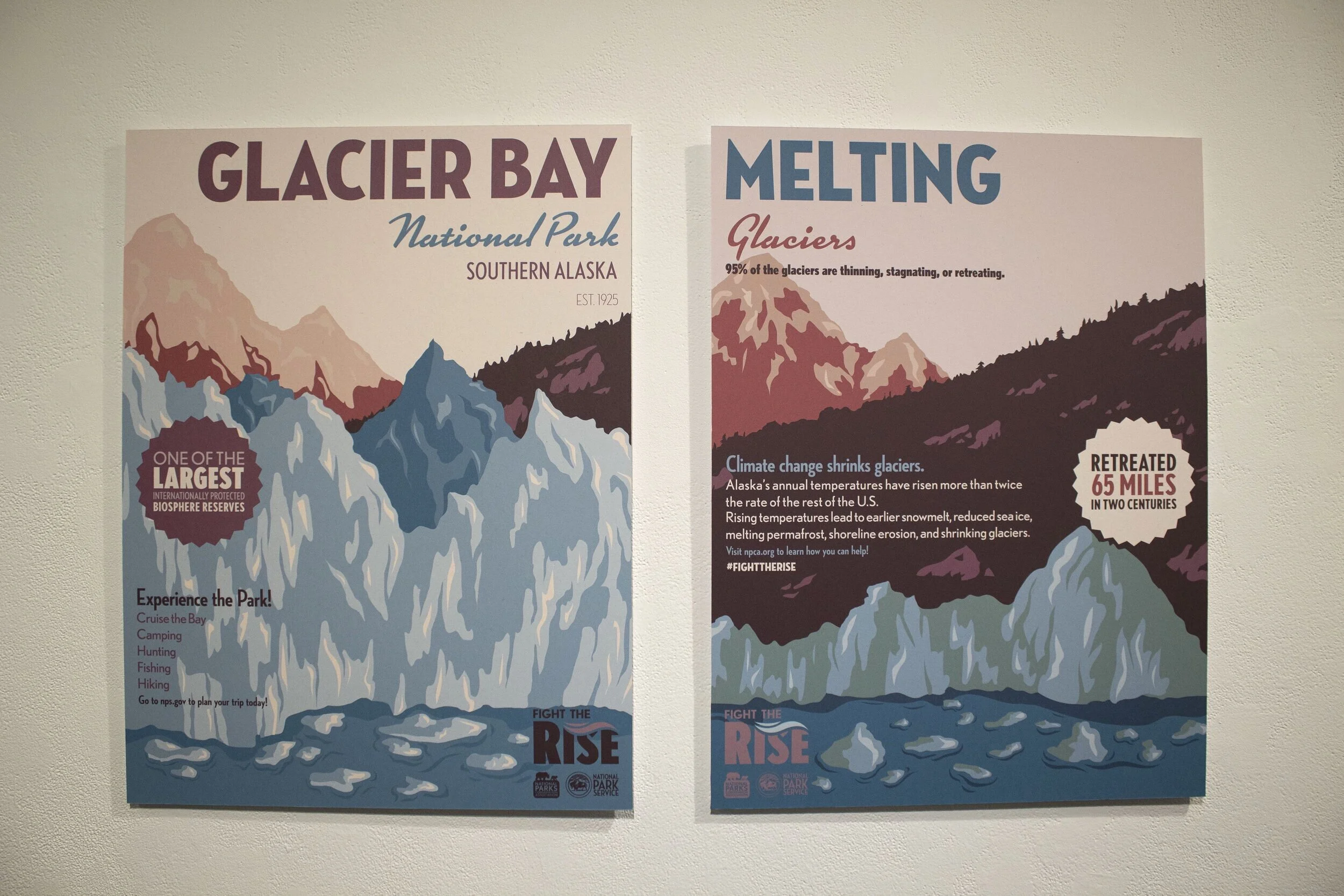
Posters have always been an exceptionally effective form of communication. However, climate change is a difficult and abstract idea to convey. Yes the world is getting warmer, but what does that mean for places like the national parks? This is where I came up with the idea to make my posters diptychs.
The first half of the diptych shows the national park as the idyllic and iconic destination we all know it as. The second half of the diptych shows how these wonderful places are being destroyed by climate change: through wildfire, drought, dying geysers, melting, or rising sea levels.
When placed next to each other both halves of the diptych create a visual narrative that shows the devastation climate change is wreaking on our national parks.


Picking the Parks
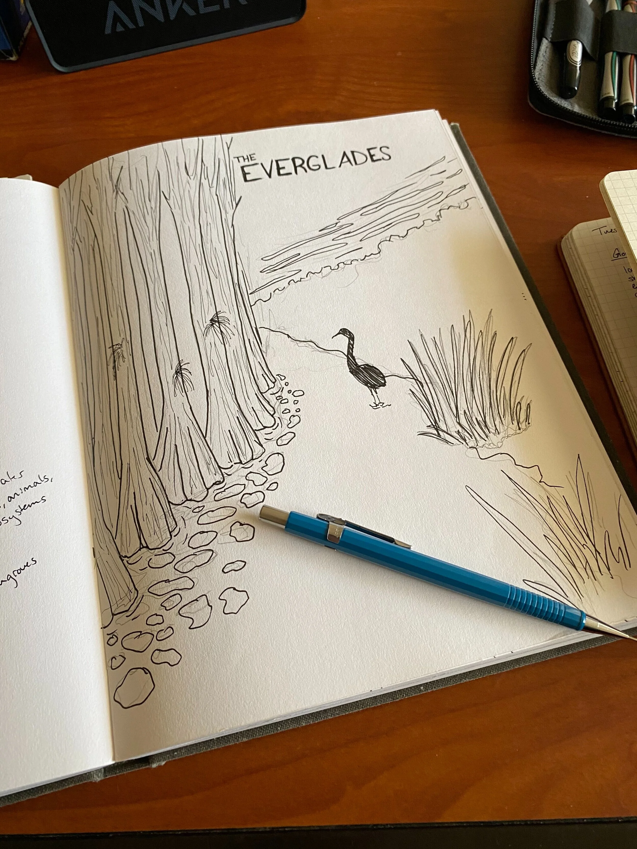
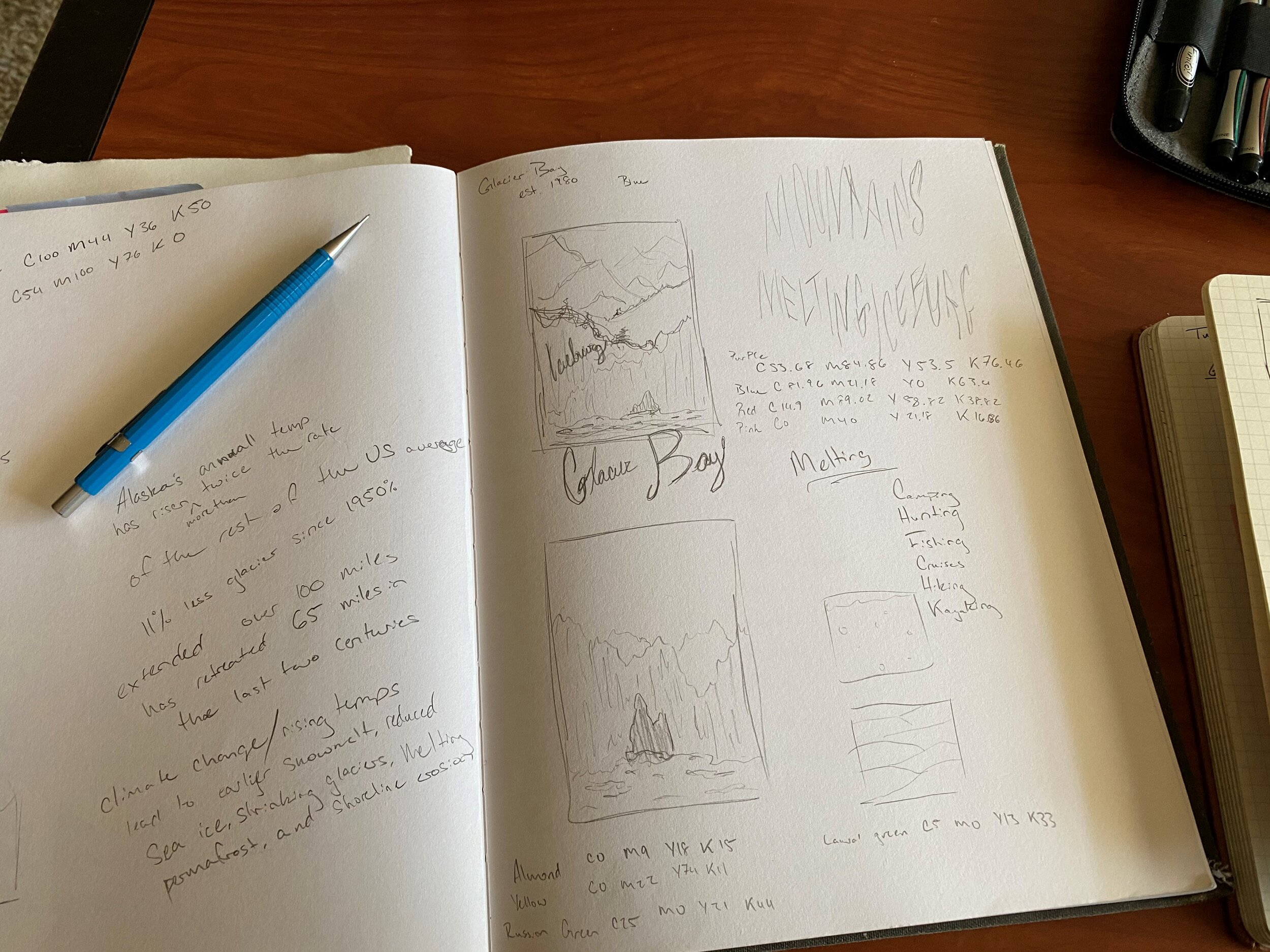
There are sixty-three national parks in the United States, so I had to narrow down which parks I was going to illustrate. Through intense research I came down to five parks: Sequoia National Park, Everglades National Park, Glacier Bay National Park, Saguaro National Park, and Yellowstone National Park. I chose Sequoia, Everglades, Glacier Bay, and Saguaro because of their vastly different climates: forests, wetlands, glaciers, and deserts.
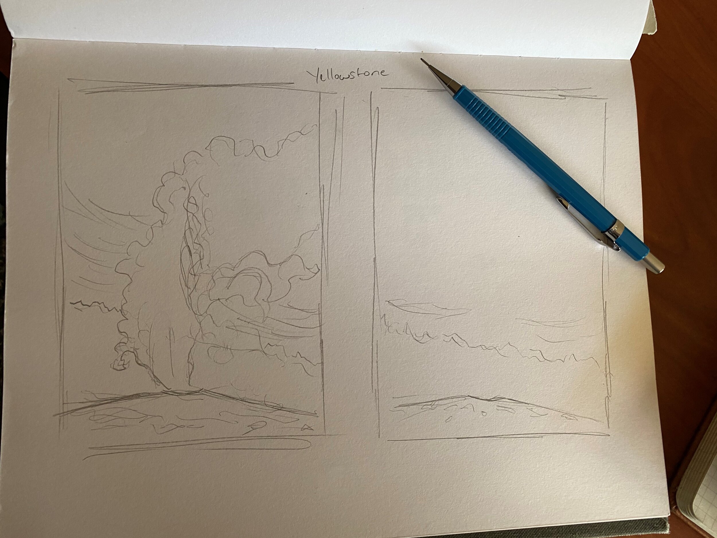
Because their climates are so different from each other, climate change is affecting them all in different ways. Sequoia is suffering from wildfires, Everglades is losing land to rising sea levels, Glacier Bay’s glaciers are melting, and Saguaro’s cacti are dying from drought. The fifth park I chose was Yellowstone National Park. I chose Yellowstone because it is the very first national park and climate change is threatening one of its most iconic symbols: the park’s geysers.
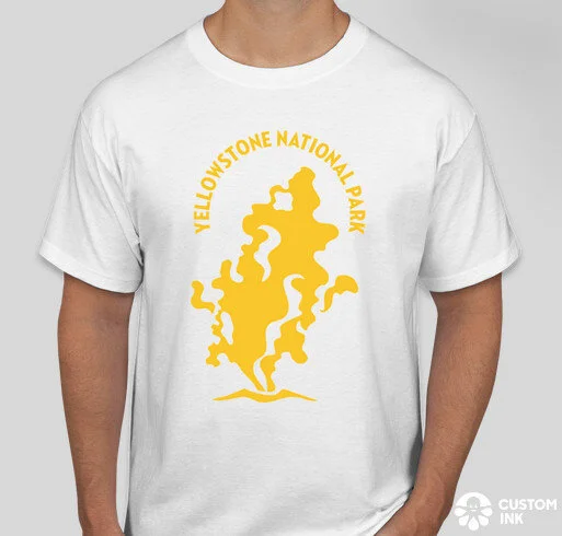
Spreading the Message
Posters aren’t the only way to spread the campaign’s message. I have designed icons of each park’s famous features for a series of t-shirts to go with my campaign. Each shirt also uses a color from that corresponding park’s poster.


How to Help
This campaign is about educating the public, but also about calling them to action. I have designed a motion graphic infographic that provides examples of ways that people can help: Reduce, Reuse, Recycle, and Get Involved. The video format allows it to reach a wider audience across multiple social media platforms.
In the Gallery
It finally came time to put up my exhibition. When thinking about how to put up my show, I was also thinking about how to work sustainably. Because of that I printed all of my posters on recycled paper, as well as made postcard sized versions of the posters on the same recycled paper for viewers to take with them. I gave my posters a whole wall to emphasize their importance in the show.